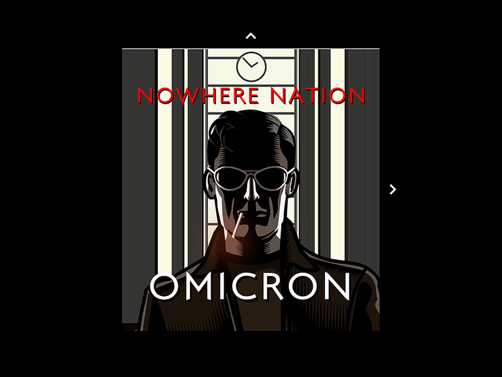
Omicron Project
by: Raleigh Green
Built with Hype Pro, The Omicron Project—the first part of a concept album trilogy—was launched in September of 2019. When I first signed on to the project, I was tasked with creating an online interactive web experience for the band, Nowhere Nation, that would accomplish two main things:
1: Feature the music of Nowhere Nation’s first full length album Omicron.
2: Showcase and animate vector illustrations created by artist/illustrator Aidan Hughes of BRUTE! Propaganda (best known for his influential KMFDM album covers).
Hype Pro was an excellent platform for building the interactive Omicron website (www.nowherenation.net/omicron). I also used Hype Pro to create a landing page (www.nowherenation.net) for the band as well as animated sequences that were used to create Nowhere Nation music video singles (click here to view the videos on the Nowhere Nation YouTube channel).
Building the Omicron website was a great learning experience due to the large scope and complexity of the project. There was one aspect of the project in particular that emerged as an unexpected challenge: image optimization.
Adventures in Image Optimization
I received the original vector artwork from artist Aidan Hughes in Adobe Illustrator format. Each song/scene contained awesome illustrations, backgrounds, and characters that were all to be layered and animated. Due to the large volume of images—14 scenes in all—and the detailed, complex nature of the illustrations, I knew that image organization and optimization would be a tricky factor to consider with this project. However, I had no idea that it would be one of the most challenging aspects.
After roughly determining the animation sequences, I began to separate the image scenes in Adobe Illustrator. Then, I placed backgrounds, objects, and characters into separate layers so that they could later be grouped and animated in Hype Pro. By the time all of the individual assets were created, the 14 scenes in the Omicron project cumulatively included over 200 individual image assets! With this many assets to manage, file name consistency and image optimization were critical.
Would modern browsers like Chrome, Safari, and Firefox be able to smoothly load and execute animation sequences built with over 200 high-res assets? The ultimate answer was, thankfully, yes. However, it took a great deal of experimentation, testing, and retesting to get the site to work reliably without browser crashing and animation stuttering.
Since PNGs (Portable Network Graphics files) have the benefit of transparency whereas SVGs (Scalable Vector Graphics files) have the benefit of resolution independence, I needed to determine which of these two file types would be the best to use, as well as figure out whether it would be solely PNG, solely SVG, or some combination of the two.
I was hoping that Aidan’s images would work as SVGs for this project so that the graphics would appear crisp on even the largest screens. Unfortunately, in testing I experienced significant animation stuttering and browser crashing on both desktop and mobile platforms. The detailed images contained too many points and vertices to be able to render smooth animations when the images were made up of SVGs alone. It was clear that Aidan’s vector illustrations were just too complicated for this approach.
So, then I tried a variety of scenarios that combine SVGs with PNGs. Surprisingly, to varying degrees, they all performed relatively poorly. All of the animations were programmed as infinite repeating loops, and SVG-based animations would sometimes start off fine, but would get increasingly choppy over time. And on some particularly complicated scenes, the choppiness would progress to the point of stalling the animations and ultimately crashing the browser.
It became clear that with images like these, SVGs needed to be used as sparingly as possible, and only on the simplest non animated object elements. I had to avoid using SVGs for any of the illustrated images. In fact, the only elements that use SVGs are the navigation arrows, audio playback controls, band logo, Nowhere Nation header text, and social media icons.
With the SVG vs. PNG question answered, pixels now had to be considered. I needed to decide what the @1x and @2x PNG sizes should be; determine the ideal overall balance of pixel density vs. file size for both mobile and desktop layouts; and optimize the result.
For ease and expandability, all 14 scenes were built as separate, individual Hype projects. Then, they were animated and converted into standard, non-persistent symbols. Each animated song/scene was a self-contained module that could be easily dropped into the main project. These modular symbol scenes were all sized at 850 x 850 pixels. They were placed into the main project along with the other page elements in a top-level parent group with flexible layout checked; zoom content checked; all pins and sizing checked; and scale behavior set to “Shrink to Fit”. Custom behaviors connected the symbol-scenes to the main project.
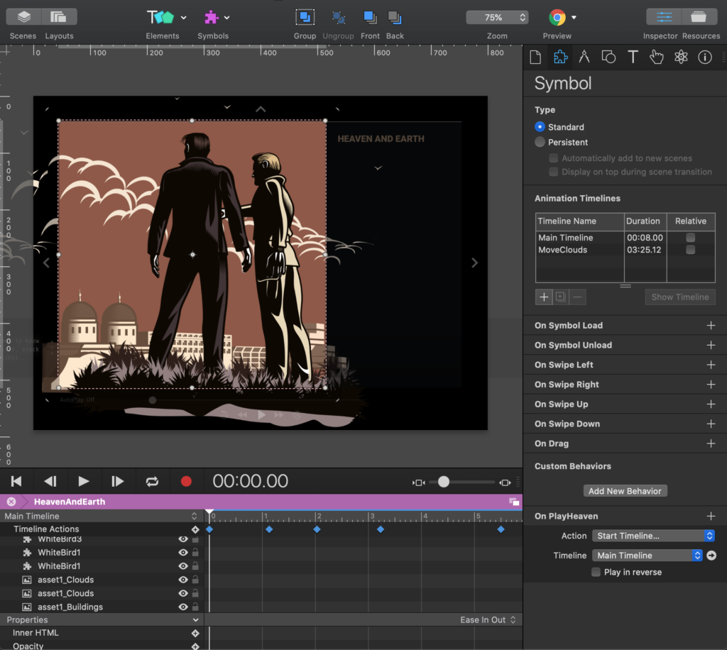
This parent-group setup allowed for great-looking responsive scaling. However, on large screens and monitors, if the PNG illustrations didn’t have a high enough resolution, the imagery would appear pixelated and jagged. So, I had to calibrate the images to have just enough pixel density to appear crisp and clean on large-screen formats but without making the images larger than they needed to be.
For proportions, I ultimately settled on full-screen @2x images roughly 2000 pixels wide/tall and @1x images were half that, around 1000 pixels wide/tall. All of the smaller assets were also sized relative to those dimensions. This image sizing standard provided a good balance of quality vs. file size. Most importantly, the images scaled nicely while retaining a high-resolution appearance on large screens.
Once the PNG images were in place and the animations were finalized, my last step was to optimize all of the PNGs. After a bit of research, I went with www.Kraken.io, which shaved off weight from the images while leaving no visible image loss! Their online image compression tools made asset loading speeds tolerable and also made the looping animations run more smoothly.
This process of testing and retesting led me to determine that complicated, multi-layered, large-scaled artwork does not animate well in SVG format. I hope that in the near future, desktop and mobile browsers—and the computers, tablets, and phones that run them—will be able to do amazing things with animated SVGs. But for now, when it comes to animating complex layered vector animations for the web, pixels are still preferable to points.
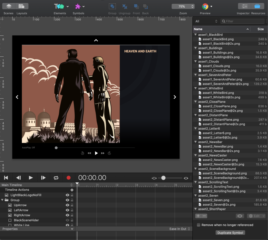
Here are a few wrap-up screenshots which highlight the features of the Omicron website.
The following screenshot shows the arrow-based navigation system:
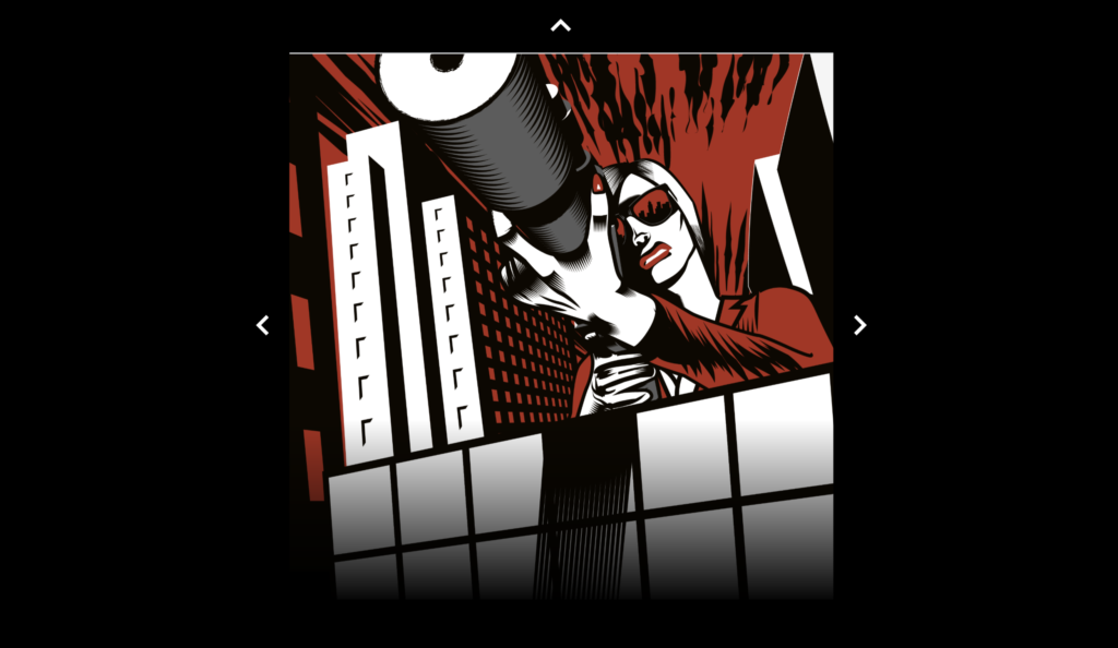
The navigation arrows trigger ‘Jump to Scene’ actions with ‘Push’ transitions. Push transitions are taxing on a browser, especially with multiple animations running and music playing. So to avoid animation stuttering, these transitions are triggered on a slight delay with javascript setTimeout functions like this:
function jumpToBackCover(hypeDocument, element, event) {

	// Fade scene to black
	hypeDocument.triggerCustomBehaviorNamed('triggerSceneTransition');

	// After a slight delay, transition to the outroScene scene
	setTimeout(function(){

		hypeDocument.showSceneNamed(‘outroScene',      			                hypeDocument.kSceneTransitionPushBottomToTop);

	},1100);
}
The following screenshot shows 4 additional features:
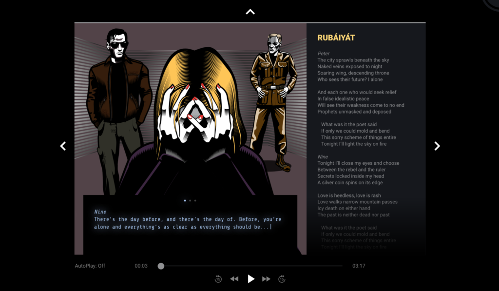
1: Hidden text popouts; when characters are tapped, hidden buttons trigger the popouts to slide out. These popouts reveal supplemental text, which looks like text being typed on a computer screen. The typing effect was created by key framing the Inner HTML of the elements containing the text.
2: Custom audio controls; the howler.js audio library controls audio under the hood.
3: An autoplay system; allows for the website to be watched/listened from song-to-song like an album.
4: Auto-scrolling lyrics; controlled by a timeline connected to the song slider.
In conclusion, thank you to the wonderful Hype community who have been tremendously supportive and encouraging over the years. I received excellent technical advice and feedback while building the Omicron site. I’m thankful to be able to work on projects that further creativity and exploration in the web space. I look forward to continuing to push the boundaries of what art can be on a web browser while at the same time giving back to the Hype community by passing on lessons learned and solutions found.
by: Raleigh Green
Project available also in Web Gallery
Would you like to get in touch? Please feel free to send me an email at . Or, find me on the web: LinkedIn, Behance, Dribbble, raleighgreen.com.